A website you don't have to think about
I build and manage websites for small businesses. You get a clean site, a simple dashboard to update it, and I handle everything else.
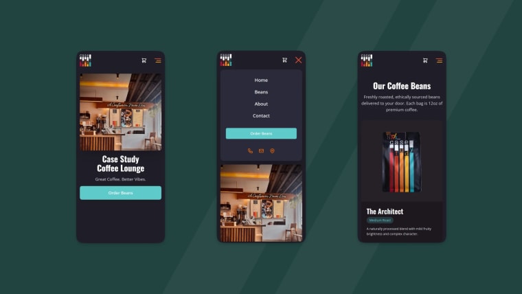
Built to be fast, clear, and easy for customers to use on any device.
Most business websites turn into something you avoid updating.
Slow, outdated, or too confusing to touch without breaking something.
I built something that fixes this.
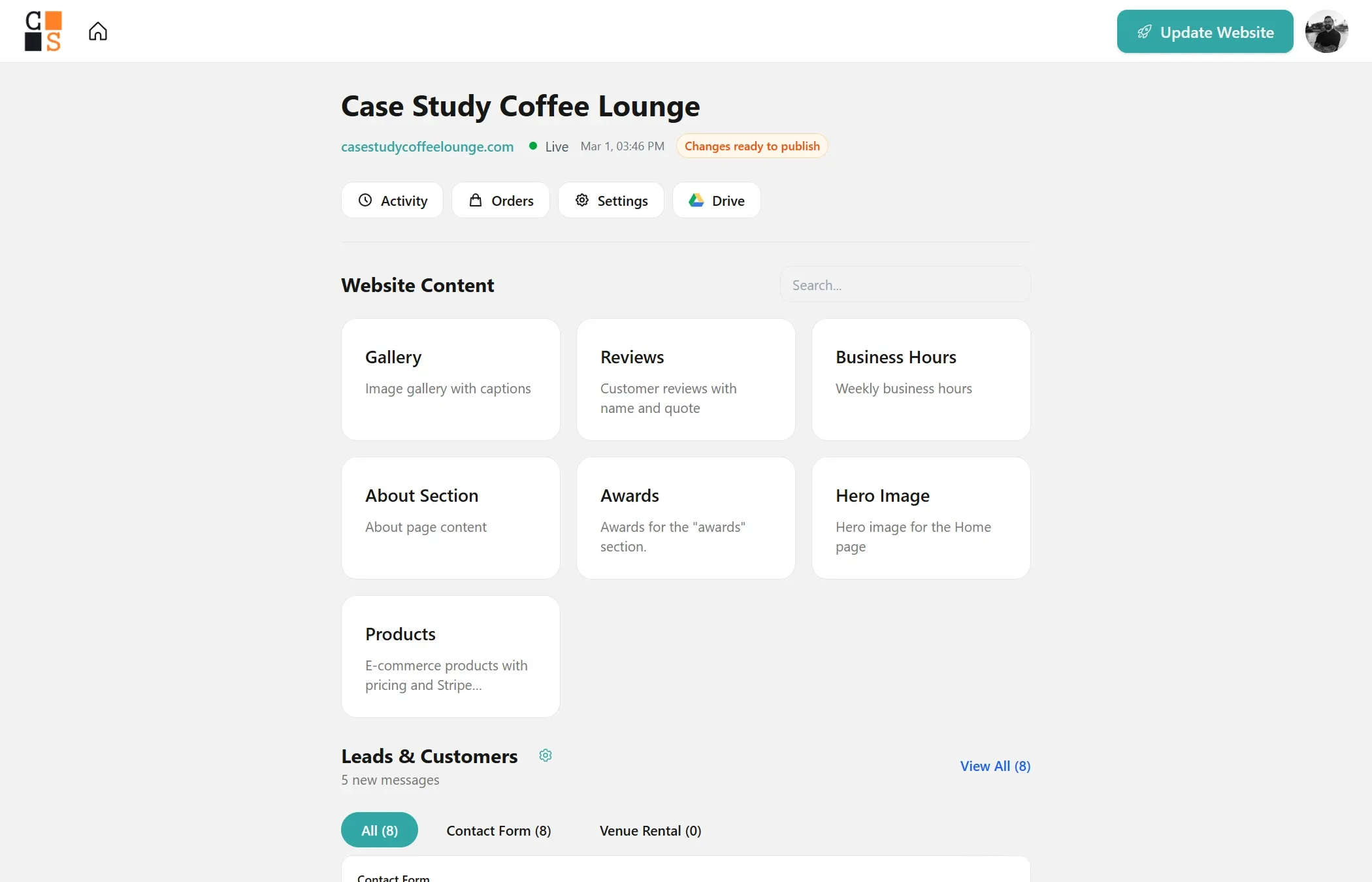
Every site comes with its own dashboard
Update content without touching code or calling a developer.
- — Update hours, events, and images
- — No plugins or confusing editors
- — Changes don't break your site
What I Build
Websites
Clean, fast sites that make your business look professional.
SEO Setup
Sites structured to rank in local search results.
Lead Capture
Landing pages that capture and qualify leads.
Online Sales
Online stores built for speed and reliability.
Member Content
Courses, resources, or private member areas.
Custom Builds
Have a unique idea? Let's build it together.
How it works
One-time build + simple monthly support
$1,500 to build your site
$50/month for hosting, updates, and support
Cancel anytime — no long-term contracts
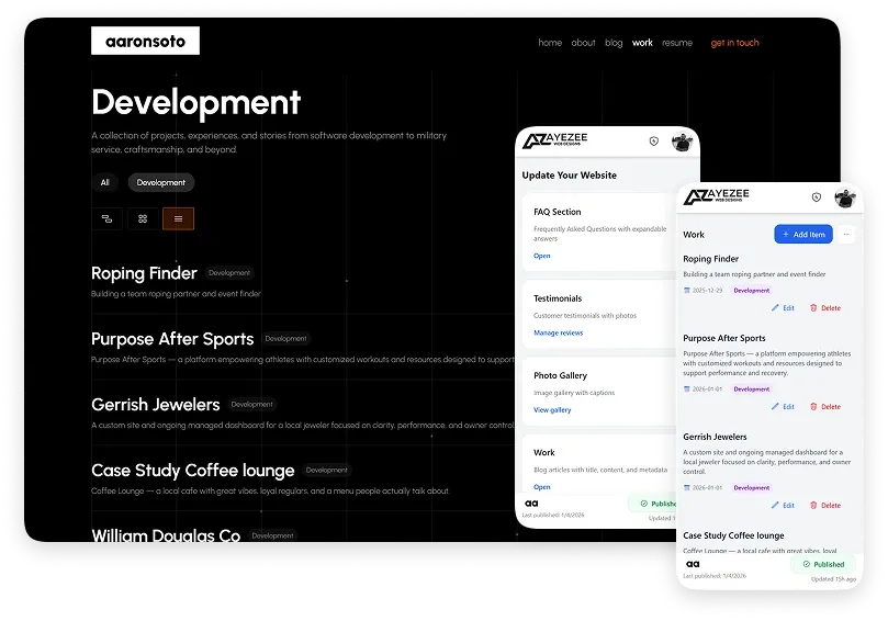
Recent Projects
These projects all run on the same control panel system.


Built by Aaron Soto
I'm a software developer in Casa Grande, Arizona and a former Army Ranger. I started AyeZee to help business owners get online without needing to learn complicated tools. I work directly with every client — no handoffs, no sales team.
More about me

